Aitken Interactive
Aitken Interactive Brand
The Aitken Interactive brand needed to accurately reflect a consultancy built on evidence-based design and strategic decision-making — not just design delivery. The challenge was creating an identity that felt considered, credible, and distinctly human in a market of generic agency brands.
- Client
- Aitken Interactive (self)
- Role
- Brand Strategist & Designer
- Duration
- 2 weeks - end to end
- Year
- Updated-2026
The Problem Statement
The Problem Statement
In an environment increasingly shaped by AI tooling, rapid prototyping, and compressed delivery cycles, the real competitive advantage is no longer the ability to produce screens quickly — it is the ability to help organisations make better decisions with greater clarity, confidence, and alignment before costly commitments are made.
The challenge was to build a brand and consultancy experience that communicated this shift clearly. The business needed to position itself not simply as a UX or design service, but as a strategic partner capable of helping teams navigate ambiguity, operational complexity, and transformation risk. At the same time, the brand still needed to feel approachable and collaborative — credible to senior product and commercial leaders, while remaining accessible to founders and teams engaging with strategic design thinking for the first time.
The Strategy
The Strategy
The strategic decision was to build the consultancy from positioning inward rather than aesthetics outward. Instead of starting with visual identity, the process began by defining the actual value being delivered: helping organisations make better product and operational decisions under uncertainty. From there, the tone of voice, service structure, messaging, and visual system were designed to reinforce that positioning consistently across every touchpoint.
The brand was anchored around three core principles: evidence over assumption, clarity under pressure, and design as strategic decision support rather than surface-level execution. These principles informed everything from the language used in proposals and workshops to the structure of the website itself.
The visual identity was intentionally restrained and composed — designed to signal rigour, systems thinking, and executive credibility without becoming cold or overly corporate.
A key part of the strategy was recognising how AI was reshaping the design and consulting landscape. As tooling continues to reduce the barrier to producing interfaces and prototypes, the differentiator increasingly becomes the quality of thinking behind the decisions themselves. The consultancy therefore positioned design not as the production of screens, but as a structured process for reducing ambiguity, exposing risk, aligning stakeholders, and creating clearer paths to action.
The result was a brand designed to function as both a portfolio and a demonstration of the consultancy’s operating model — showing not only what was produced, but how strategic clarity, workflow thinking, and evidence-led decision-making can shape better outcomes long before anything is built.
Approach
Approach
The process moved through four distinct stages, each producing a concrete output before the next began.
Positioning & Value Proposition
Defined the consultancy around a clear strategic premise: helping organisations make better product and operational decisions before costly commitments are made. This involved analysing the positioning of traditional design consultancies, identifying an opportunity around decision intelligence and workflow strategy, and reframing design as a mechanism for reducing ambiguity rather than simply producing interfaces. The resulting value proposition was designed to resonate equally with founders, product leaders, and executive stakeholders navigating transformation and AI-driven change.
Tone of Voice Development
Developed a tone of voice system that balanced strategic authority with clarity and accessibility. The language needed to communicate confidence and rigour without sounding performative or overly corporate. Messaging frameworks were created across multiple contexts — including website copy, proposals, workshops, LinkedIn content, and case studies — ensuring the consultancy consistently positioned itself as a thoughtful strategic partner rather than a conventional design vendor.
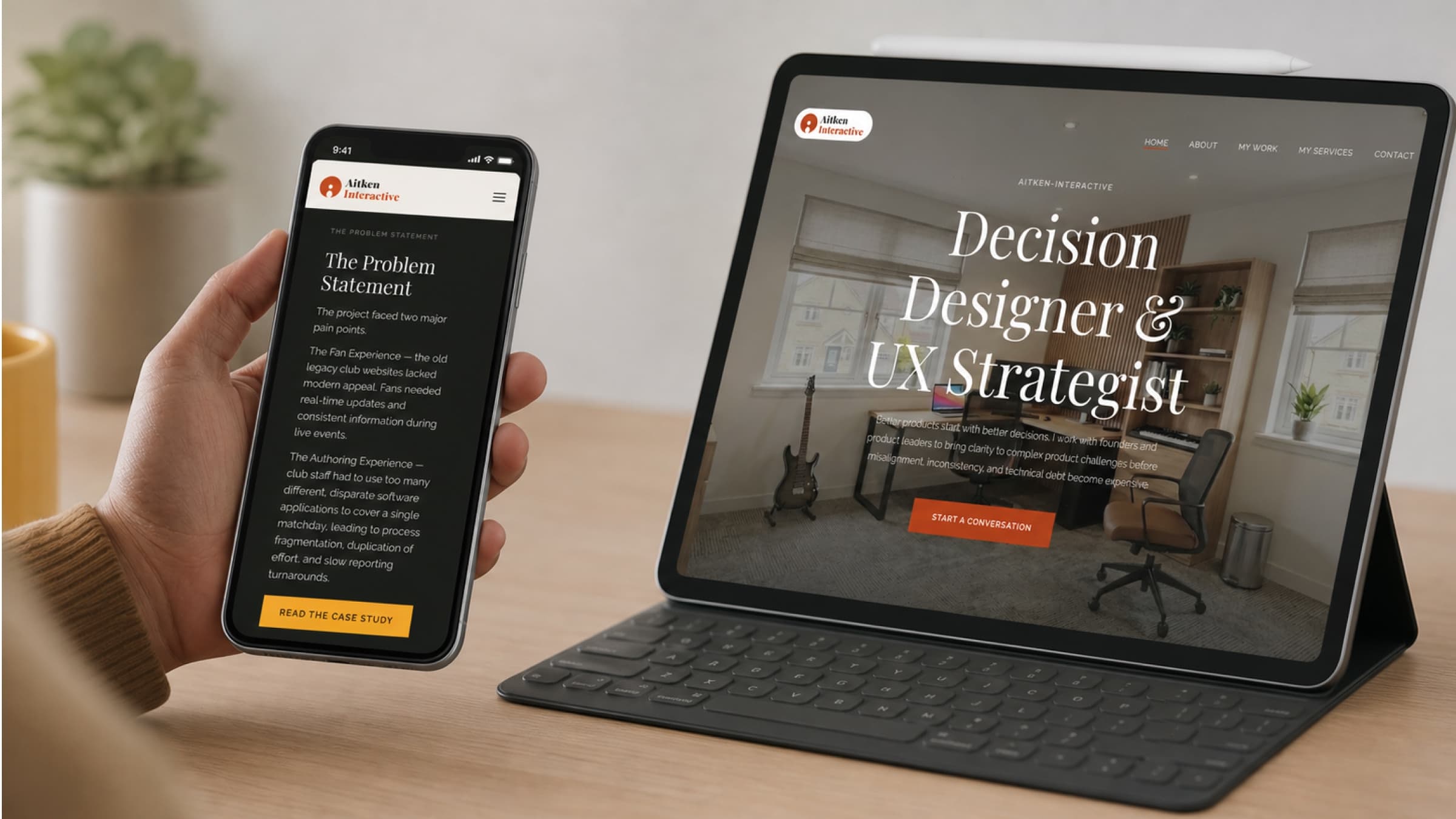
Visual Identity System
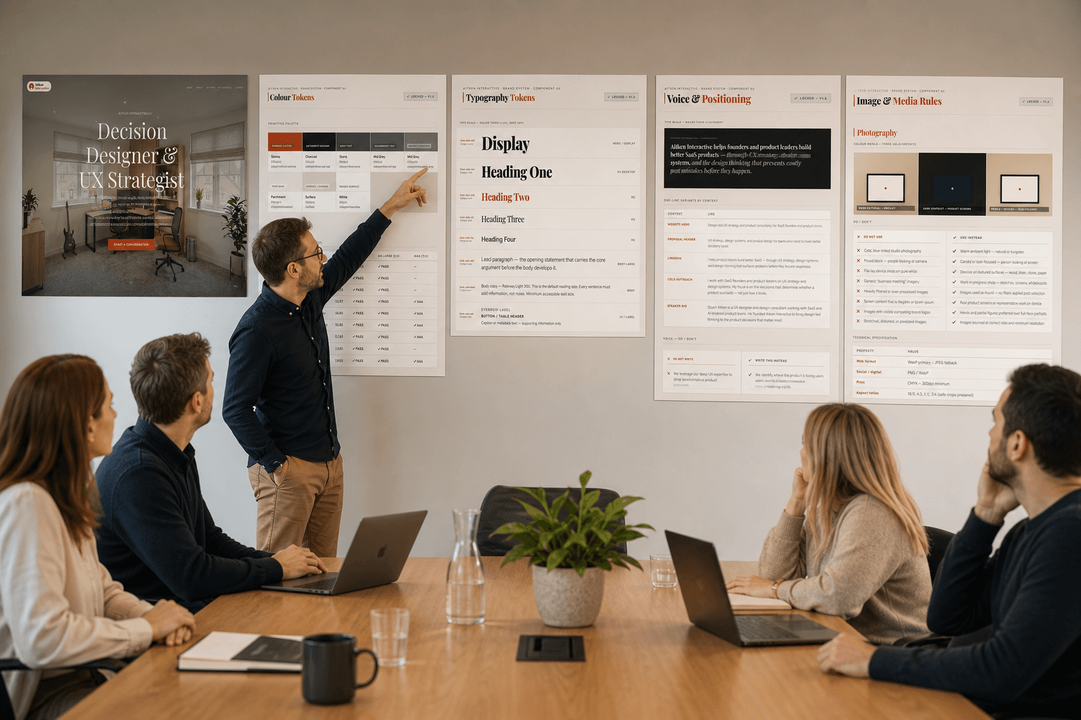
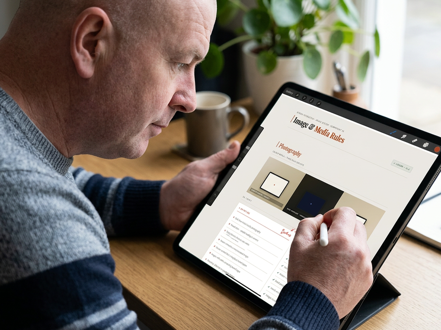
Designed a visual identity system intended to reflect systems thinking, clarity, and executive-level composure. Typography, colour, spacing, iconography, and layout behaviours were all selected to support the consultancy's positioning around evidence-led thinking and operational clarity. The visual language intentionally avoided trend-driven agency aesthetics in favour of something more restrained, structured, and enduring — capable of supporting both strategic consulting engagements and product-focused delivery work.
Brand System & Operational Application
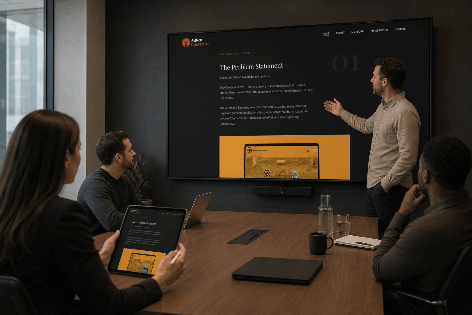
Built the brand as a functional operating system rather than a static identity package. The final system included brand guidelines, reusable design components, proposal frameworks, presentation templates, messaging structures, and a modular portfolio architecture aligned to the consultancy's strategic positioning. Every touchpoint was designed to reinforce the same core idea: that good design is not decoration, but a structured process for creating clarity, alignment, and better organisational decision-making.
The Brand System
The Brand System
The final brand system was designed to function as both a consultancy identity and a demonstration of the consultancy's thinking model. Rather than treating branding as a visual exercise alone, the system was built to communicate strategic clarity, operational rigour, and evidence-led decision making across every touchpoint.
The visual identity combines restrained typography, structured layouts, minimal illustration systems, and a muted editorial-inspired palette intended to convey composure, systems thinking, and executive credibility. The tone of voice balances strategic confidence with accessibility — avoiding inflated agency language in favour of direct, grounded communication focused on clarity, outcomes, and decision quality.
The system extends beyond traditional brand assets into reusable operational tooling. Deliverables included a defined value proposition, messaging frameworks, tone of voice guidance, visual identity standards, proposal and presentation templates, portfolio storytelling structures, reusable UI and content components, and a modular Figma-based design system supporting future scalability.
Importantly, the brand itself became a working example of the consultancy's philosophy: reducing ambiguity, aligning intent, and creating clearer pathways to action before execution begins. Every interaction — from a homepage headline to a workshop framework — was designed to reinforce the same core idea: that strategic clarity is a competitive advantage in an increasingly AI-accelerated world.
Outputs
Outputs
The completed brand system established a clearer strategic position for the consultancy and fundamentally changed how the work could be communicated to prospective clients and collaborators. Rather than presenting as a traditional UX or design service, the brand repositioned the practice around strategic clarity, decision support, and systems thinking — creating stronger alignment between the consultancy's expertise and how it was perceived externally. The work also created a scalable operational foundation for future consulting engagements. Beyond the website and visual identity itself, the system introduced reusable frameworks for proposals, presentations, workshops, case studies, and discovery activities — allowing the consultancy to operate more consistently across both strategic and delivery-focused engagements. Perhaps most importantly, the project clarified the consultancy's own point of view in an increasingly AI-driven industry. As tooling continues to commoditise production output, the brand became a deliberate statement that the real value of design lies in judgement, evidence, workflow understanding, and the ability to help organisations make better decisions before execution begins.
Reflection
Reflection
Designing a brand for yourself is fundamentally different from designing for a client. Without external constraints or stakeholder pressure, every decision becomes a direct reflection of your own clarity and conviction. The challenge was not creating the visual system — it was defining what the consultancy genuinely stood for and being disciplined enough to build every layer of the brand around that position.
One of the biggest lessons from the project was recognising how much the role of design is changing in the age of AI. As interfaces and production outputs become easier to generate, strategic thinking, systems understanding, and decision quality become significantly more valuable.
This project ultimately became less about building a portfolio website and more about defining a long-term consulting philosophy: helping organisations reduce ambiguity, align around evidence, and make stronger decisions before costly execution begins.
The process also reinforced something increasingly central to my own practice — that strong brands are not built from aesthetics alone. They are built from clear thinking, coherent positioning, and the ability to consistently communicate why your perspective matters in the first place.
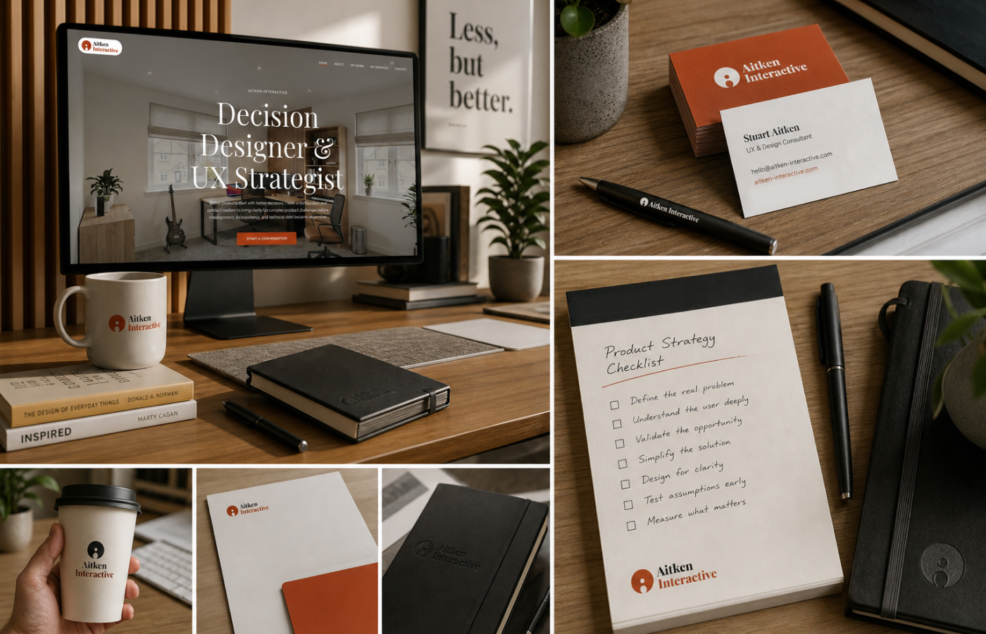
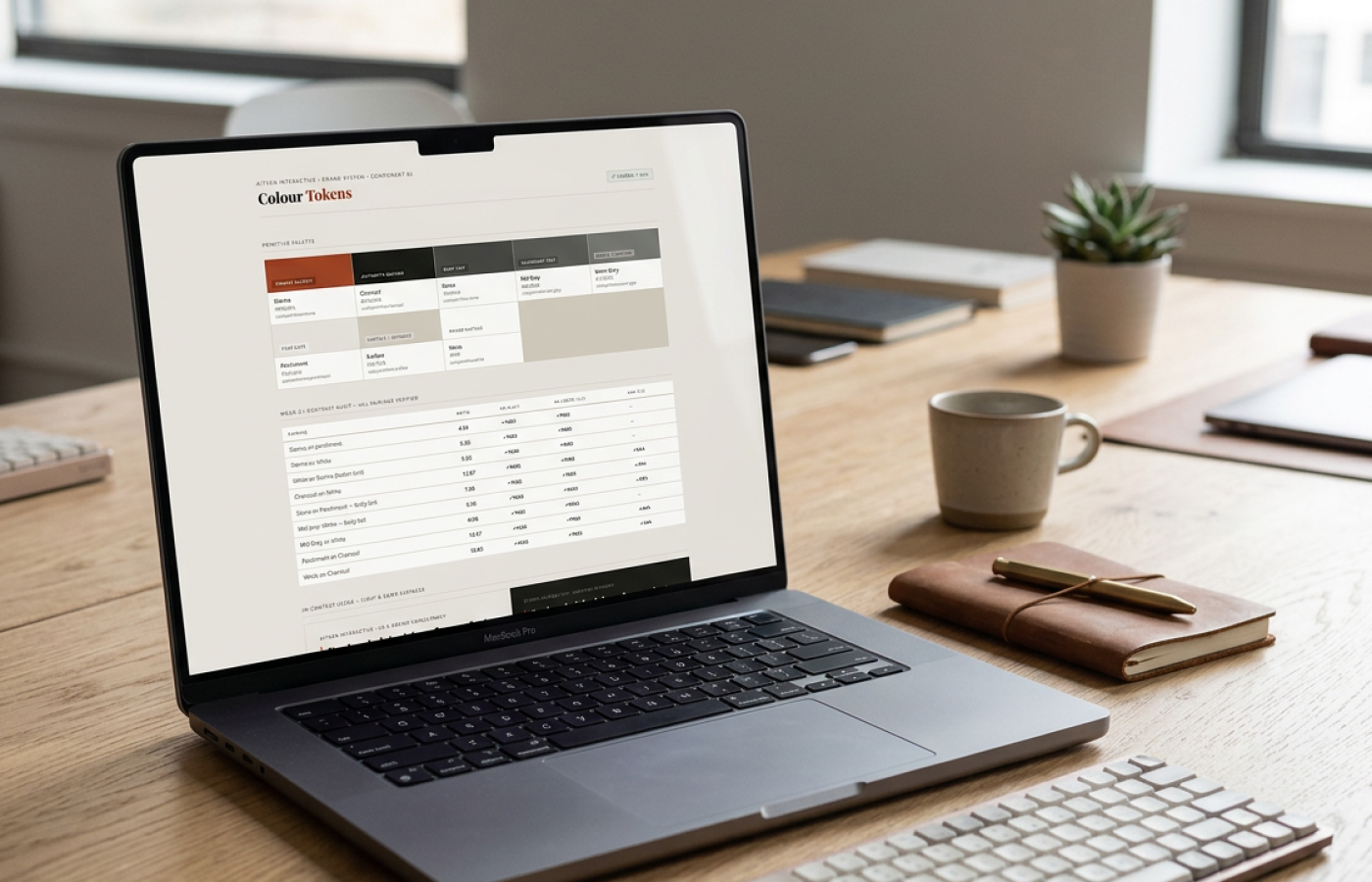
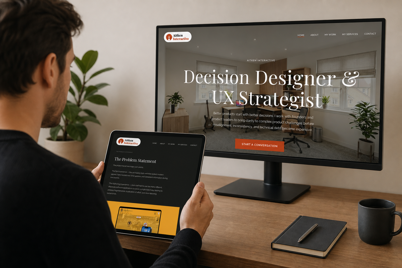
Project Gallery
Project Gallery


Next Project
Seventy-Two Audit
→