
MOD — Recruitment Partner Portal
Recruitment Partner Portal
A large government organisation needed a comprehensive way to manage a massive body of job applicants through a rigorous eligibility process. The goal was to provide an excellent, engaging customer service experience throughout a lengthy application lifecycle.
- Client
- MOD — RPP
- Role
- Senior user experience designer
- Duration
- 2 years
- Year
- 2020/21
The Problem Statement
The Problem Statement
The existing user experience suffered from multiple issues.
Applicants lacked context and understanding of desired outcomes throughout the process. Long periods of inactivity passed with no communication from the organisation. The process required single-session completion, making it impossible to save and resume progress. Users were repeatedly asked for the same information. The business suffered from a large drop-off in website traffic, with content inconsistent across the digital estate.


The Strategy
The Strategy
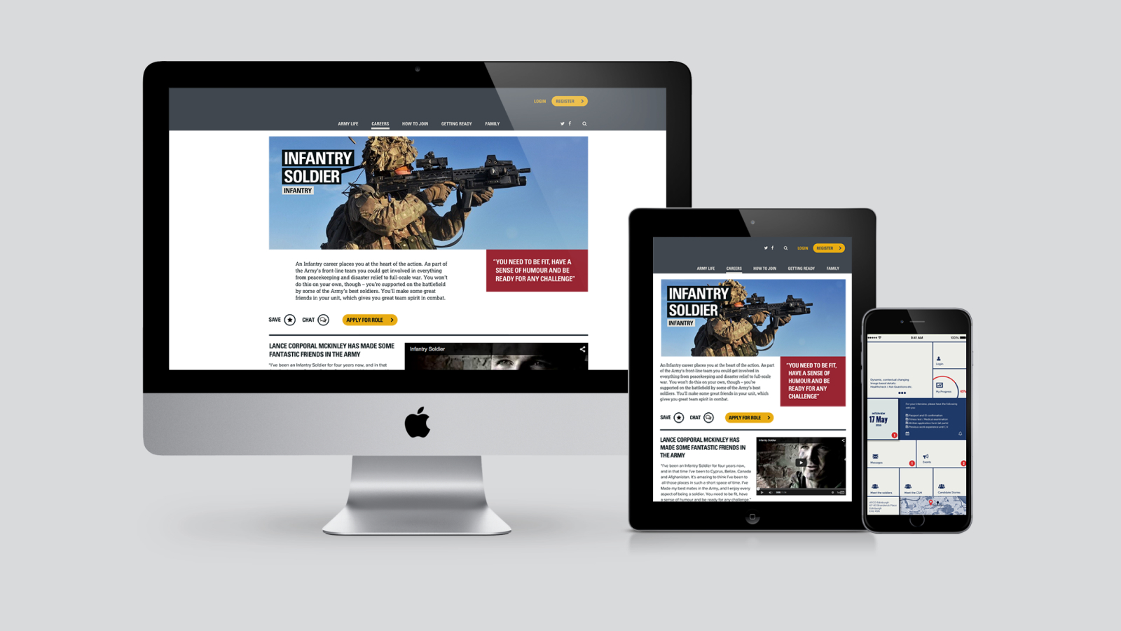
The core strategic decisions centred on three priorities: ensuring a consistent language and experience across multiple platforms (app, website, isometric camp); allowing applicants to save progress and resume later; and developing mechanisms to keep users engaged during long periods of downtime.


Research Methods Used
Research Methods Used
A multi-faceted approach was used to address both user needs and business constraints across a two-year engagement.
User Research & Analysis
Understanding user needs, goals, and observed friction points throughout the recruitment journey—from initial application to final decision.
System and Content Audits
Analysing the current digital estate for consistency, authoring difficulty, and accessibility requirements across all platforms.
The Solution Delivered
The Solution Delivered
The solution was a unified, integrated system spanning multiple touchpoints.
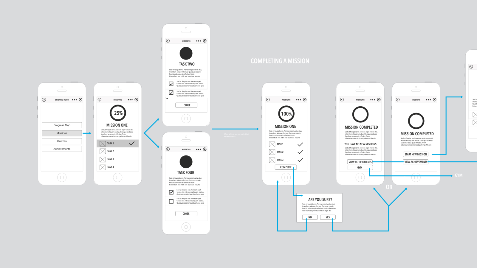
User Experience — allowing users to save progress, maintain a point of contact for guidance, and track their application status via a gamified experience.
Business Experience — enabling content authors to manage content through a single CMS, reducing overhead and simplifying governance across all platforms.
Data — ensuring all required information was collected only once, streamlining the entire process and reducing duplication.

Outputs & Outcomes
Outputs & Outcomes
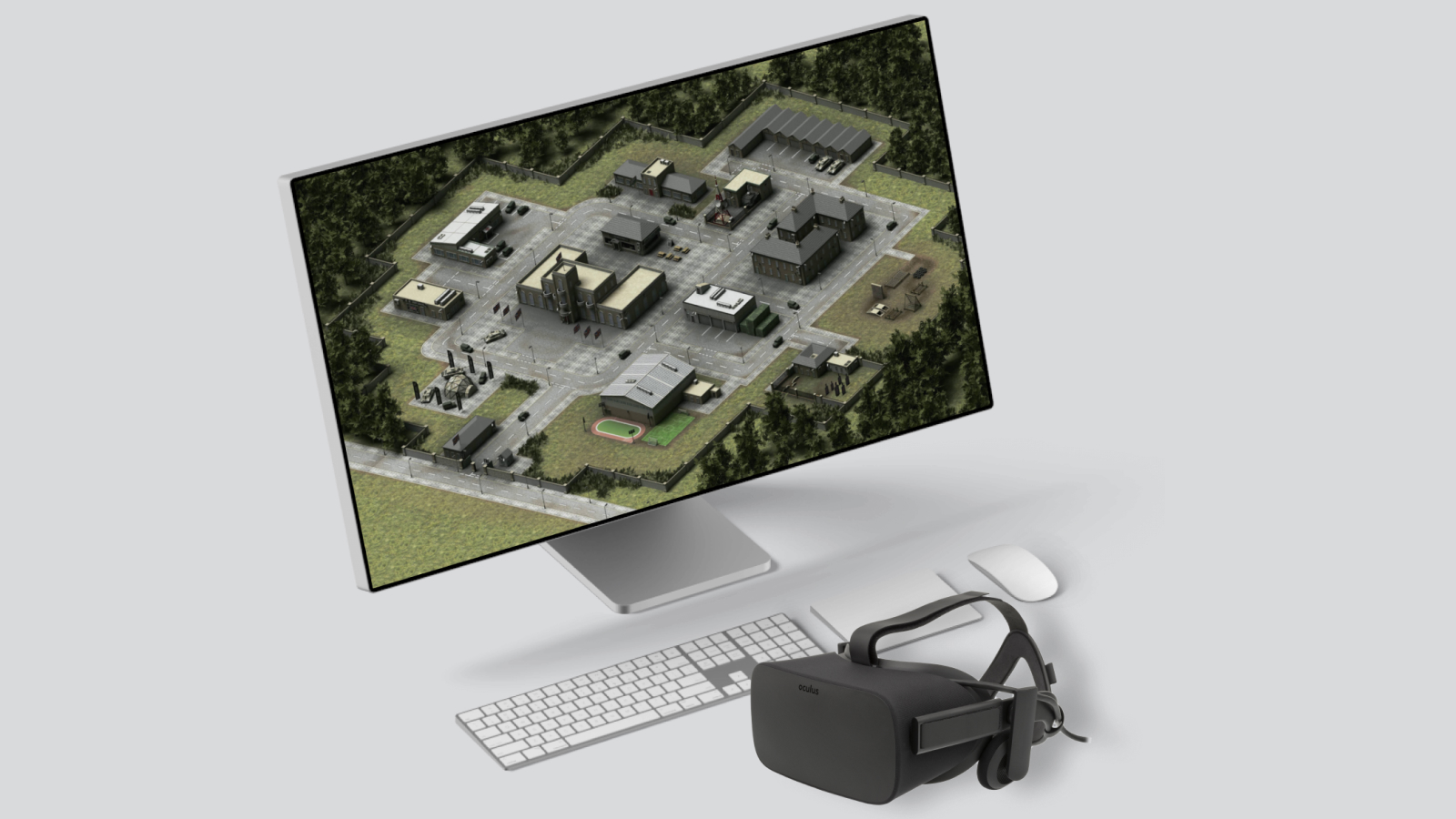
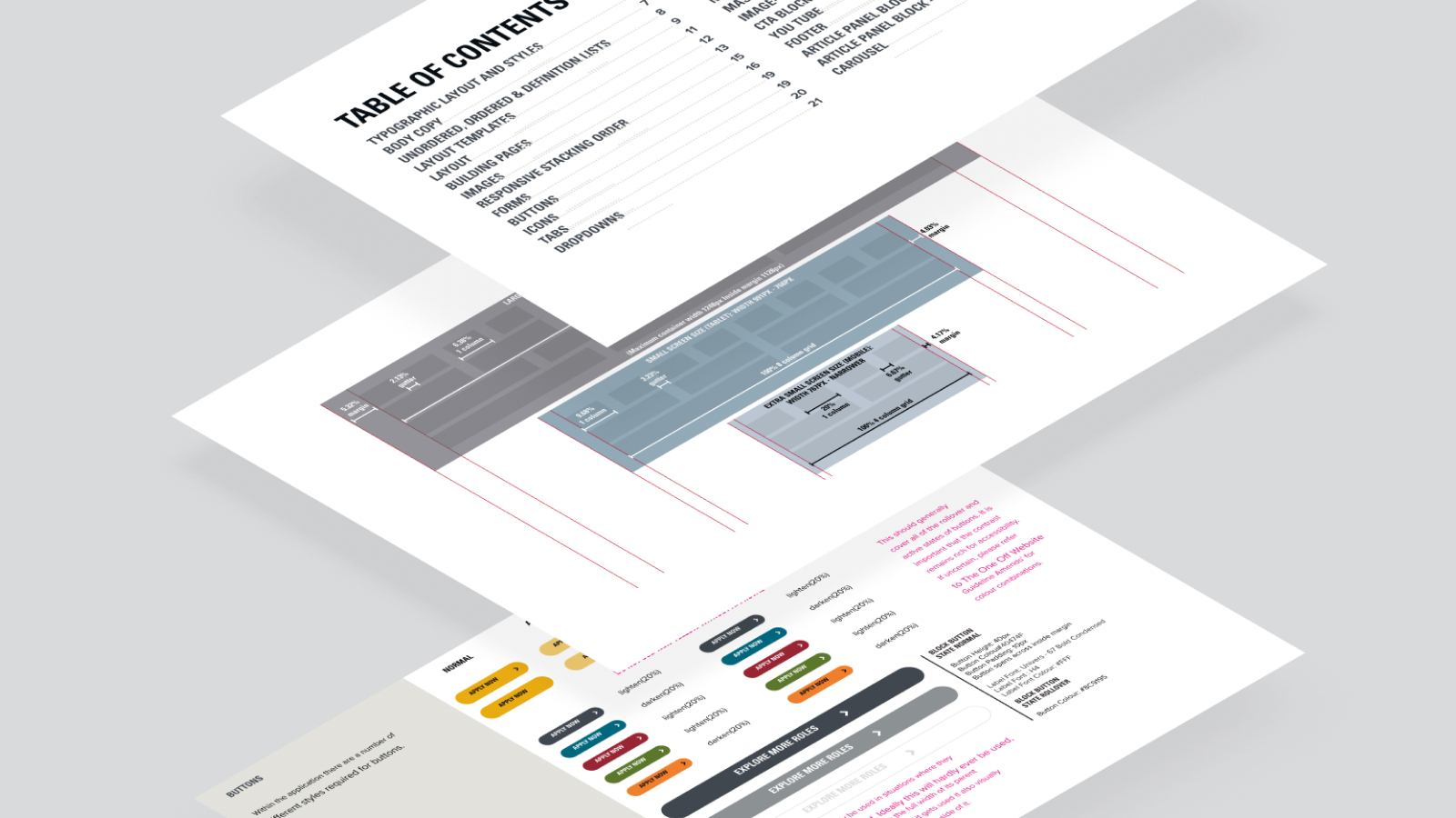
The development of a comprehensive digital ecosystem that addressed both applicant needs and content authoring complexities. Key outputs included the design system, brand guidelines, and the conceptual 'isometric camp' view designed to set realistic expectations for applicants at the outset.
Reflection
Reflection
The primary lesson was the importance of comprehensive discovery—specifically, running an initial sprint dedicated to user expectations and UX discovery to alleviate difficulties faced downstream. Further observational research and paper prototyping would improve future projects of this scale.
Project Gallery
Project Gallery

Next Project
Rocktrust
→