Rocktrust — Rocktrust

Rocktrust

Rocktrust

Lead user experience designer·6 weeks + ongoing·2022

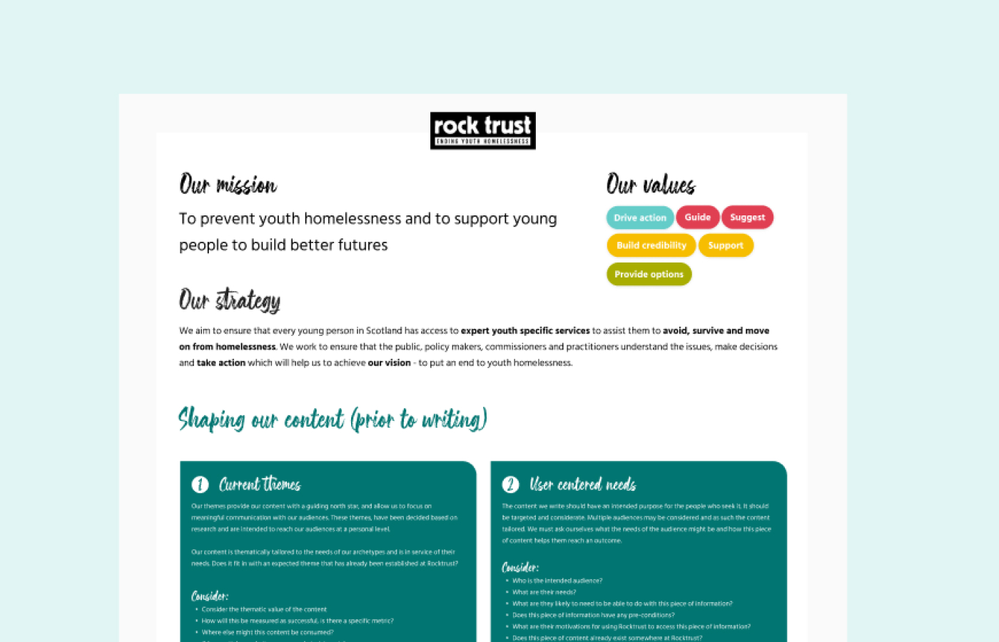
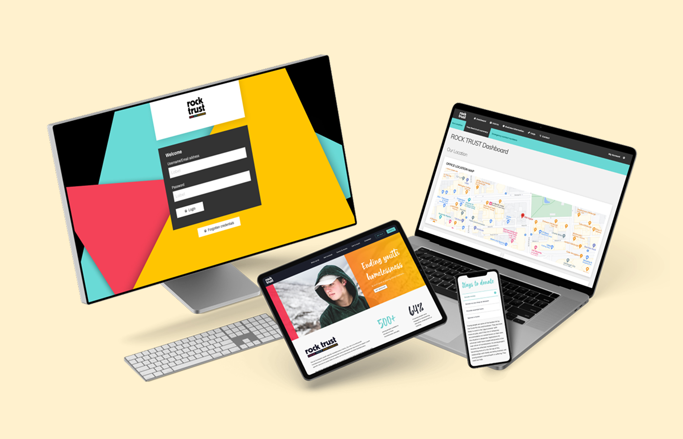
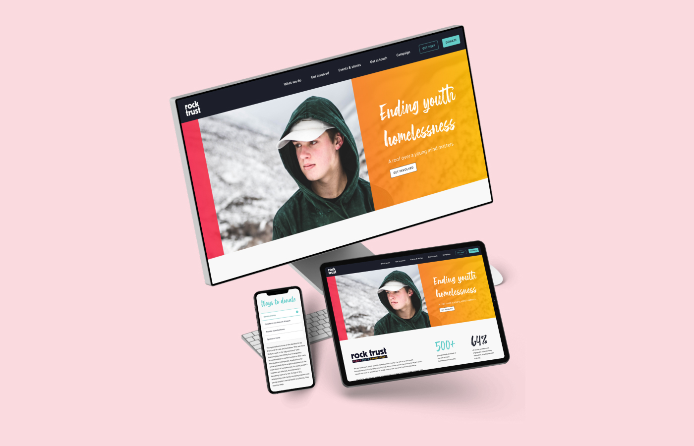
Rocktrust is a charity focused on ending youth homelessness. They required a digital platform that not only improves brand awareness and facilitates donations but, most importantly, ensures beneficiaries can easily find the immediate, life-saving support they need.

Client
Rocktrust
Role
Lead user experience designer
Duration
6 weeks + ongoing
Year
2022

The Problem Statement

Rocktrust needed to build a platform that could grow alongside the charity while addressing multiple functional needs: improving general brand awareness, enhancing digital content offerings, building a scalable platform for future growth, fostering longer-lasting relationships with volunteers and contributors, and simplifying the donation process to demonstrate value to beneficiaries.

Rocktrust's existing website and content structure.

The Strategy

The strategy was to create a technology-agnostic design system and content strategy. By decoupling the design from the chosen CMS, the solution ensures the platform remains flexible and scalable—allowing the charity to maintain full ownership and control of their own content backlog without dependency on a specific vendor.

Review of their existing website. Ran workshops with the team to better understand the problem they were trying to solve. Helping them make better decisions about how to think about thier brand.
We created storyboards for our development teams. This was to create a sense of empathy and understand of the importance of the Rocktrust value proposition.
I created a design system, along with design specs that development teams could use to build the platform. This was to ensure that the charity had full ownership and control of their content backlog, without being dependent on a specific vendor.

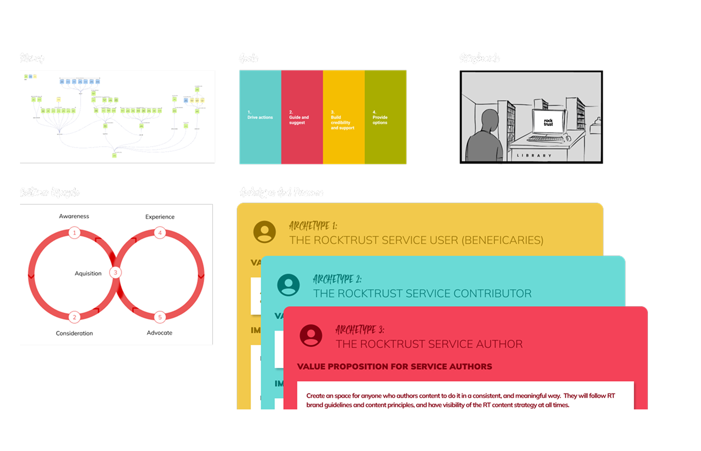
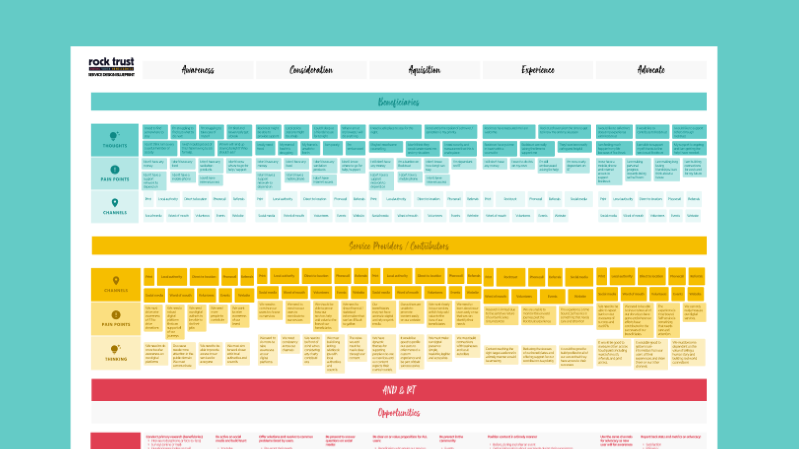
Research Methods Used

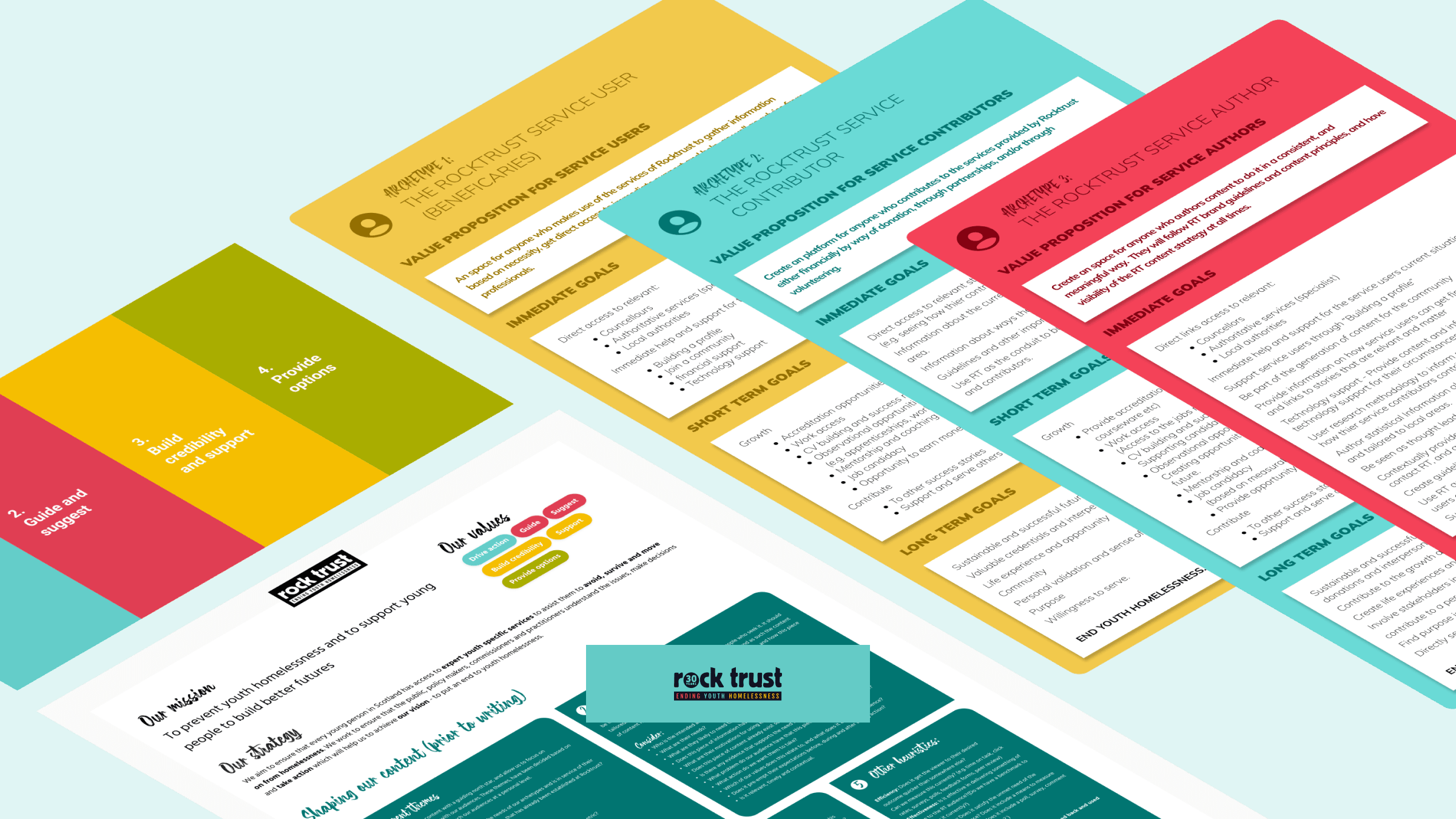
A robust mix of research was conducted to cover all stakeholders—beneficiaries, contributors, and authors.

01

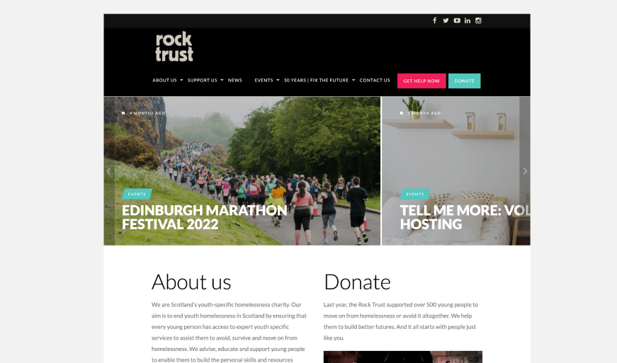
Desk Research & Audits

Initial analysis of the existing site and content flow to understand the current state and identify immediate gaps.

02

Stakeholder Workshops

Alignment workshops focused on brand values, value propositions, and defining the core needs of contributors and authors.

03

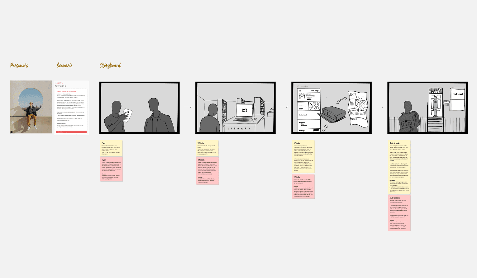
Human-Centred Mapping

Conducting empathy mapping, archetypes, personas, service blueprinting, and customer journey mapping for all three user types.

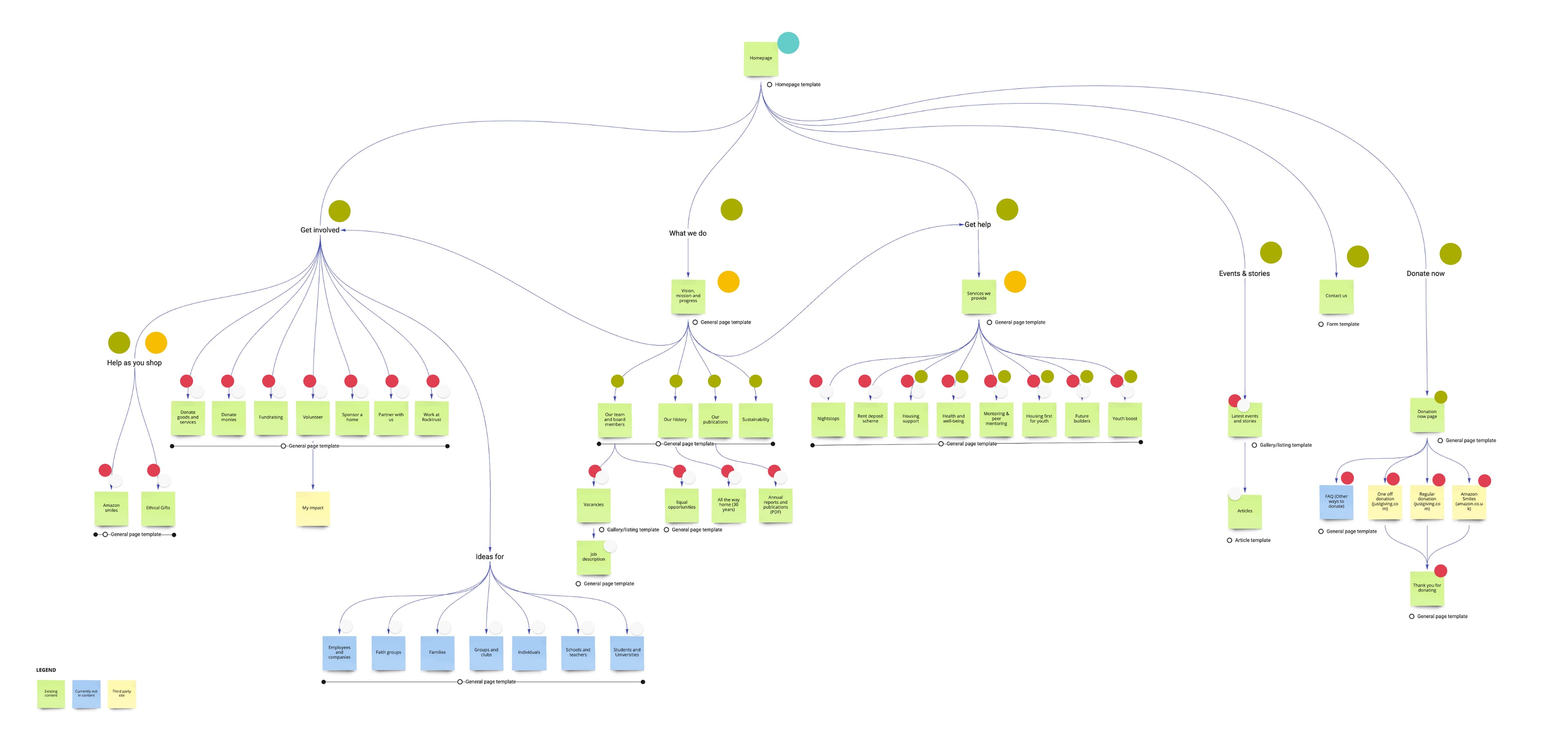
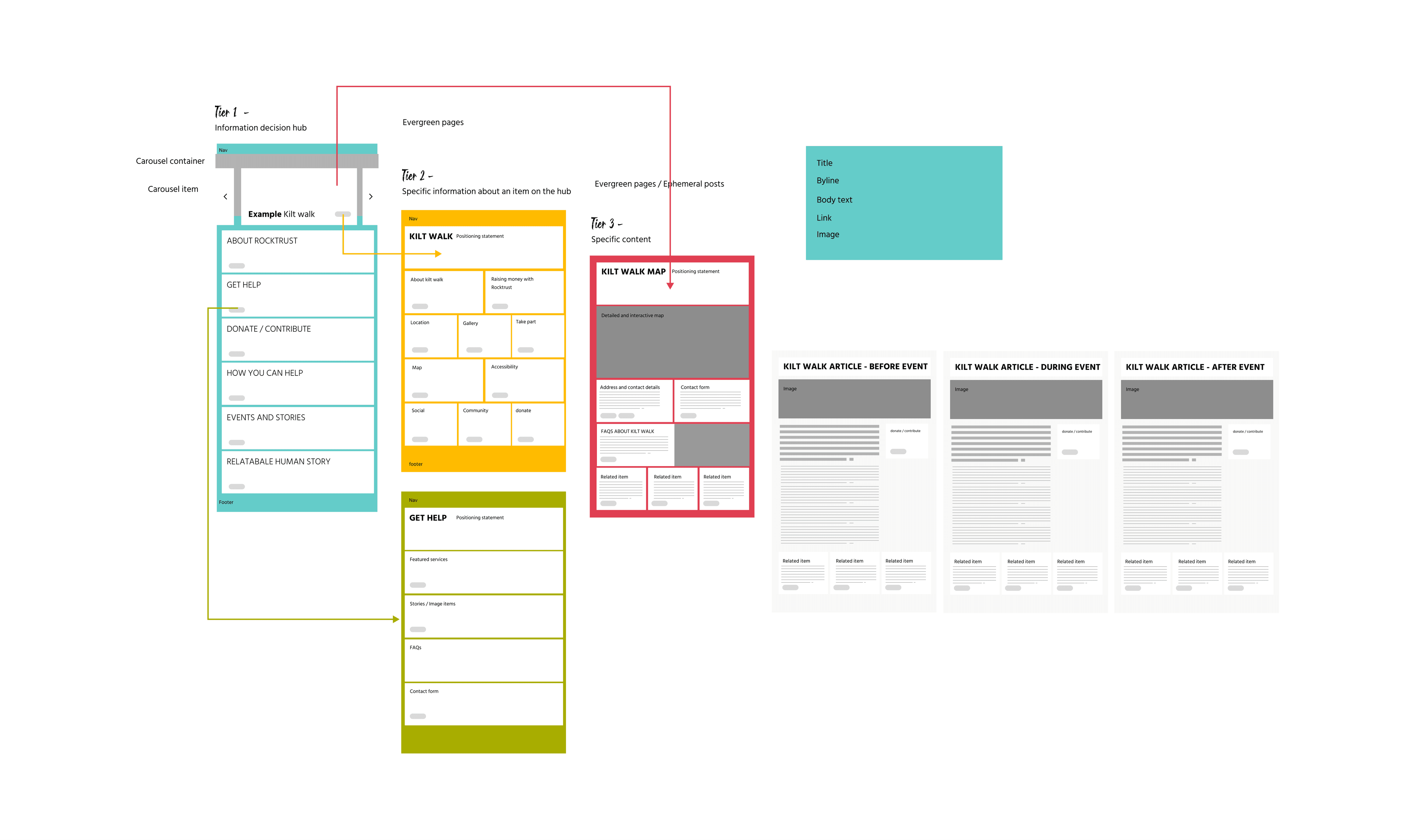
The Solution Architecture

The solution is designed to empower ownership and scalability.

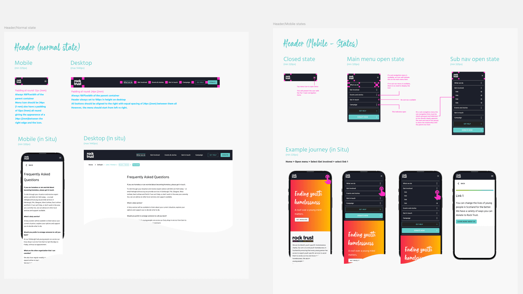
Design System — providing a comprehensive, reusable component library in Figma.

Content Management — helping the charity remove technical dependencies and giving them full control over their content.

Experience — articulating clear visual designs for three main archetypes (beneficiaries, contributors, and authors) that align with the brand tone and guide continuous content discovery.

We collaborated with their team and internal development teams to better understand the website structure. Separating out themes, for ephemeral, editorial and evergreen content.
We structured the content, and the information architecture, to ensure that the content was easy to find and navigate for all users. This was to ensure that the platform was designed with the beneficiaries at the centre of the experience.

Outputs

3Core archetypes defined — beneficiaries, contributors, and authors
FigmaReusable design system & component library delivered

The project successfully delivered a detailed visual framework built around core archetypes and a reusable design system. The output included storyboards, personae, and a fully structured site architecture that guides both the technical development team and the internal content teams.

Reflection

While the project is ongoing, the main lesson learned was the constant need to guide the client towards focusing on the measurable impact of the service—ensuring the digital solution always serves the primary mission of the charity rather than becoming a general-purpose website.

Project Gallery

We created a lot of important artefacts during the course of the project including Personas, Storyboards, Service Blueprints and Customer Journey Maps.
The marketing team were heavily involved in the project, as they were responsible for creating a lot of the content that would be used on the platform. We worked closely with them to ensure that the content was aligned with the brand values and tone.
Reponsive design and accessibility were key consideration throughout. We wanted to ensure that the platform was accessible to all users, regardless of their device or abilities. We also had a huge campaign focus on users who had no access to devices, but who still required the service.
Service deisign blueprints were created to help the charity understand the end-to-end experience for beneficiaries, contributors and authors. This was to help them understand the importance of the digital platform in supporting their core mission.
All beneficiaires were mapped out in detail, with a focus on understanding their needs and how the digital platform could best support them. This was to ensure that the platform was designed with the beneficiaries at the centre of the experience. This included, people donating, event planners and volunteers.
Great Rail Journeys

Great Rail Journeys